Redesigning RTÉ.ie
A responsive redesign system for rte, the website of Ireland’s Public Service Media Organisation

The RTÉ homepage is the gateway to one of Ireland’s largest sites with more than 400,000 daily users visit. Users expect the most important events and news to be displayed with the best of RTÉ’s content, all beautifully presented for their convenience and enjoyment.
While the current RTÉ homepage is functional, it lacks features to promote user engagement and content discoverability. Additionally, there's no clear personalization for logged-in users.
To redesign rte’s homepage to allow users to quickly and efficiently navigate to their topic of interest. Develop a clear navigation structure hierarchy based on the actual modular system that is implemented.


Mobile Dominance
-The layout of the navbar changes when scrolling (RTÉ logo left aligned)
-There seems to be 3 different navigation bars, and it is not clear what the last one is showing (breaking news maybe?)
Lack of white space
When static:
-If well known icon is shown then there is no need to name it (Weather and Menu)
-The RTÉ logo seems not properly aligned since below appears the entire name of the company.
When scrolling:
-If well known icon is shown then there is no need to name it (Weather and Menu)
-We add the main categories to the navbar, losing too much white space and the result is an overcrowded design.

Lack of Hierarchy and White Space:
-Although main new is clear, there are too many elements at the same time trying to grab users attention
User Interface Design
-Dividing the UI elements into cards is a great way of making content clear for the user, however, filling the actual cards with a color makes the entire design overwhelming.
-Cards have a stroke at the bottom which provides even more visual noise.


-All three sections show really interesting design decision and they manage to show a lot of information without being too overwhelming for the user. However, every design element being inside “boxes”, makes the design a little bit too chunky.
-Each section works on its own but there is no real cohesion in terms of the design language that each one uses.

Placement
-I think it is really interesting for the user to be able to see what other users are reading (popular articles), but I consider that it looses its potential for being the last section of the homepage

Displayed Information
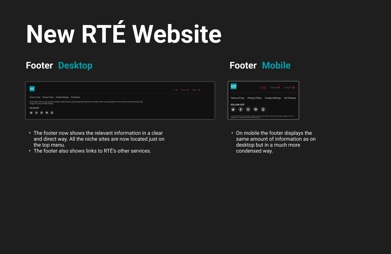
-Almost all of the information on the footer is redundant, since it is also located on the menu of the navbar.
I created three main archetypes based on their behaviors in order to consider goals and motivations first.
A busy professional who prioritizes quick access to headlines, breaking news, and the ability to save articles for later.
Goals: Quickly access breaking news and save articles for later reading.

A curious individual who enjoys exploring diverse content genres (documentaries, science articles...) and seeks recommendations for new content.
Goals: Discover new and interesting content beyond the homepage.

A viewer interested in local news and programming relevant to their region, desiring a personalized homepage experience.
Goals: Access local news and programming relevant to their region.


-Conduct user testing with the redesigned website and ensure that critical needs have been addressed.
-Incorporate RTÉ’s internal user data and user behaviors into the redesigns user experience.
-Give users the possibility of saving articles.
-Display news based on the user location.
-Allow users to personalize their home page experience by selecting the topics they always want to see displayed.
I learned to focus my attention on a single problem and develop it further through design iterations and user input.
I also realized that it is crucial to limit the main features of an application to those that have the most impact in order to produce a minimum viable product with the intention of optimising development time and costs.