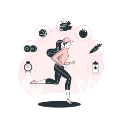
Sometimes all we need
is just to move.
UX & UI DESIGN . 2 MONTHS . CONCEPTUAL PROJECT

Lorem ipsuqwdam dolor sit amet, consectetur adipiscing elit. Suspendisse varius enim in eros elementum tristique. Duis cursus, mi quis viverra ornare, eros dolor interdum nulla, ut commodo diam libero vitae dwqdwqdq. Aenean faucibus nibh et justo cursus id rutrum lorem imperdiet. Nunc ut sem vitae risus tristique posuere.
A research by the Spanish Obesity Society (SEEDO) suggested that 53.8 percent of Spaniards are overweight, specifically 36.6 percent overweight and 17.2 percent obese. Analyzing this worrying data, I decided to carry out this conceptual project with the challenge of creating a solution that would guarantee that the people of Spain would take a more proactive approach to their own health and well-being and find a way to promote exercise and make it enjoyable.
This was an individual concept projetcs where my roles included project management, UX research, analysis, strategy, ideation, prototyping and testing,
Interviews, business analysis, competitive analysis, systems mapping, user journey mapping, wireframing, prototyping, usability testing
I started by concentrating the majority of my investigation on current studies and interviews about habits and exercise. By defining and developing many archetypes, I was able to discover the primary factors that motivate people to exercise and to focus the app on accountability. I then proceeded to prototype and user test the ideas.
One thing that people fail to understand is the fact that we humans expend energy throughout the day, not just when we exercise. The energy we absorb in the form of fat is the energy left over from what we have consumed through food and not burned throughout the day. There is a misconception that by exercising a lot we burn a lot of energy when this is not true. The body burns up to 70% of calories to keep the organs functioning, 10% of the energy is dissipated as heat and 10-15% with our daily physical activity that does not require a high heart rate. As we can see this leaves only 5-10% for demanding exercise such as running or going to the gym.
What many people fail to understand is that it is much more important to maintain an active lifestyle than to go to the gym every day in order to be healthy. Activities such as climbing stairs or walking are very beneficial for our health and help us to go into a calorie deficit, i.e. to expend more energy than we consume daily.
On this basis, I need to find a solution that helps people to maintain an active and non-sedentary lifestyle.

There are many solutions that focus on habits and exercise. Users can use apps, gym memberships, personal trainers, step-counting wristbands, exercise newsletters, etc.
All of these solutions offer different approaches towards the goal of achieving a routine with healthy and sustainable habits.
In order to find out which solutions really offer the best results for users, I have conducted several interviews. The questions focused a lot on trying to understand why they use these solutions, and how they affect their habits.
Interviews were my most effective research method, as I wanted to obtain more qualitative data from existing statistics. I was able to conduct five rounds of interviews throughout the design process.
These interviews allowed me to understand the real needs of the users, and why they were not able to maintain healthy habits to lead an active life. They have also been useful to define the advantages and disadvantages of the different solutions on the market in order to define which one best solves the problem and, therefore, which one should be the way forward.

In order to comprehend user pain points, sensations, and experiences better, I later plotted the training habit behavior on a route map. The course of a typical user habit is depicted on this map, from the initial step to habit retention and consequence. I discovered how customers feel throughout this procedure and when they are most likely to stop from our interviews. On the map, two different paths are depicted: green represents the user's ideal path and red represents their actual journey.


I learned some important things from my investigation, which I divided into two primary categories. First, there are the factors that encourage people to exercise regularly, and then there are the restrictions that prevent people from doing so.
People's complaints about not having enough time to fit exercise into their hectic schedules is a major barrier. I discovered some intriguing motivators, such as the fact that taking baby steps and not overloading yourself could lead to quitting. According to this research, it is also simpler for people to progressively increase the difficulty of their tasks, which enables them to be more reliable over time. Users were encouraged to keep up their fitness routines by holding each other accountable in the social component.
From the research done I understood that the best solution was a smartwatch app that is complementary to the mobile phone version. This way I can provide adequate solutions for the real problems of the users thanks to designing for devices that accompanies them in every moment of their daily lives, having become part of their lifestyle.

So, after engaging with the users to actually understand what do they use, I started to analyse the main apps on the market (Apple Fitness, Google Fit, Streaks...) and where they put their emphasis and efforts. From this analysis I extracted this key points of this apps:
·Clear and short onboarding, focused on showing main value driver to achieve aha moment asap.
·Focus on users feelings·Motivational copy and quotes
·Clear homepage CTA focused on main value driver
·View daily progress and weekly reports·Motivation through badges, streaks and stats
·Challenge and compete with friends
I created two main archetypes based on their behaviours in order to consider goals and motivations first.
Behaviours: Has a strict schedule so little to no time and is new to exercise.
Goals & Motivations: Start working out and adopting a more active lifestyle while forming healthy habits.
Needs: They don't have a lot of time to dedicate to exercising specifically, so anything convenient that can fit into their busy work schedule.

Behaviours: Constantly tries and abandons new habits, has poor time management, has many interests that tend to start but not finish.
Goals & Motivations: They really want to maintain the new healthy habits they start, the visible results help them stay motivated.
Needs: They need to start developing simple, small habits that are easy enough to mantain at the beginning and to scalate in the future.
From the research and by creating the archetypes, I was able to extract what they need and define that the app should help the archetypes to manage their habits in order to push themselves further and improve their exercise habits in the long-run.
Based on this premise, I have defined three characteristics the app has to acomplish and the layout tone of each one:
Always open and personal, I want users to feel real support and empathy, to show them that there is always someone who cares about their health.
This has to be an easy to use app, which leads users to just focus on the content, not in the process.
Building the right habits is not an easy task so it should be handled in an engaging and funny way. Users need to be motivated by rewards and encouragement to create healthy habits and make them their lifestyle.
Freshly Courageous
Positive and engaging energy all around.

I conducted some preliminary testing, and the results were extremely encouraging. Users appeared to be thrilled about the concept that they would remember to take 5–10 minute breaks from sitting and walking as a result of the app.
A more appealing progress system was required by some users, to encourage people to remain with their objectives and keep going.
We have a better knowledge of what we are designing thanks to this comments. To solve this I decided


Having clear the direction of the project, I started sketching different ideas based on the idea of designing a friendly and simple app that contains all the necessary elements for the user and that shows the progress and growth in a clear way.
Remember that this app should help users to maintain an active life, that is, it is not focused on demanding exercise at a specific time, but to help the user to walk more, climb stairs more often throughout the day... in other words, to move more.
One of the main focus points is to draw the user's attention when they have spent too much time being sedentary.
This reminder screen will appear several times throughout the day if the user is not active, and will instead be replaced by messages of motivation and recognition of effort if the user has had an active day.

Users can see their progress for the day by the number of steps they have taken.
The goal of this feature is to help people visualise their goals and be aware of their progress.

This feature is for showign in a visual and appealing way the weekly/monthly performance of the user.
Here the user can challenge itself by setting up a goal of daily steps and by trying to mantain or surpass that obejctive.


Engaged by the idea of how simple activity can help them
The reminders were a great feature

There seems to be a lack of something to help the user to really get more steps and be more active.
There was no information about calories and distance
I kept in mind all the user feedback when building the wireframes and imrpoved the features commented.


I continued developing the design and started polishing the ui and copywriting of the app.

This is the initial screen with which the app warns the user that it is time to get going because it has not been active for too long. The idea here is to greet and encourage the user with a personalised welcome message.
The time and a call to action button are displayed so that the user can indicate the start of the activity.

After listening to user feedback I incorporated a system of levels ranging from the lazy sloth to the unstoppable turtle and ending with the mighty rabbit.
Each level represents the amount of activity done during the day and the goal is to reach the final state of the


If users scroll down the screen they reach the rhythm section, where they can measure their heart rate and heart rate in real time.

This last screen shows your progress throughout the week along with your average steps, calories burned and distance walked.

The feedback was overall very positive and users were motivated to challenge themselves to achieve the status of mighty rabbit day after day.
In a later update, I would like to further develop the app and add more functionalities such as sleep monitoring and different physical exercises.
I also have in mind to design an app for mobile devices to increase the functionalities and to find more detailed information about the day to day life.
I learned to focus my attention on a single problem and develop it further through design iterations and user input.
I also realized that it is crucial to limit the main features of an application to those that have the most impact in order to produce a minimum viable product with the intention of optimising development time and costs.
