Design of a banking app
to organize all your finances
UX & UI DESIGN . 1 week sprint. CONCEPTUAL PROJECT

With the current technological evolution, the procedures that must be done in person feel out of time. It is necessary for the user to be able to perform the desired actions from the bank's platform.
The objective of this project is to create a platform to provide the user with the necessary tools to manage their bank accounts in the most personalized way possible based on their needs.
Most banks focus their efforts and resources on trying to sell their products to their customers, pension accounts, stocks, loans... ignoring the human factor and its impact on the well being of the users.
So this platform is focused so that any user of any bank can organize their bank accounts, creating sections based on the interests and needs of users without having to do any kind of management in the bank in person.
This project comes from the need to cover a personal problem that I found when I wanted to organize the money in my bank account directed to different sections but without having to open different bank accounts or perform any kind of management in person.
For this I have done several investigations in the finance field, where I have observed the different relationships that people have with their money depending on their financial culture. Once the research was done and with the insights obtained from the users interviewed, I have given a solution to these needs through different functionalities within the platform.
For the design itself I wanted to go towards a completely different line than the current bank apps, showing all the functionalities clearly and intuitively. That is, the app is completely designed to offer the most satisfactory experience possible for the user.
The project has been executed under te Design Sprint methodology developed by Google. It is a methodology for solving problems through designing prototyping and testing ideas with users. By using this methodology I have been able to test my problem solving skills within a tight time frame, so I have had to optimize to the maximum the processes and decisions taken.
It is necessary to fully understand what are the needs of our users to be able to propose solutions and improvements to the problems they have. So I conducted different interviews and user tests on the apps that are currently on the market, evaluating the features that users miss.
Once the evaluation of the different apps was done and having collected different insights, I defined the strategy to follow in the design of the app.
KEY INSIGHTS:
·It must be linked to the user's bank account and updated every time money is deposited or withdrawn.
·It should be possible to create folders (savings, expenses, investment, rent...) and allocate the money required to each of them.
·The user should be able to have the option to automatically allocate X % of their income to these sections.
"Thanks to this app it is possible to organize your bank account in different sections and distribute the money in the desired way to each of them without the need to open more than one bank account".
For the design, the new architecture and user flows were defined keeping simplicity and ease of use to the maximum. Performing different A/B and usability tests I came up with the design of a high fidelity digital prototype.. Before the programming of the final prototype, new user test were executed to analyze if the desired Ux was achieved and if the experience complete all the key features.


After conducting several interviews with users I decided that the app should be visually appealing while displaying as much information as possible without being saturated.
I decided to minimise the number of pages to just 3 so that all the necessary information was easily accessible to the user. In addition, each page has a very distinctive and unique visual look.
I continued developing the design and started polishing the ui and copywriting of the app.

This is the initial screen with which the app warns the user that it is time to get going because it has not been active for too long. The idea here is to greet and encourage the user with a personalised welcome message.
The time and a call to action button are displayed so that the user can indicate the start of the activity.
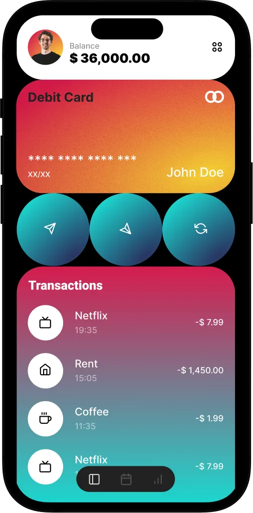
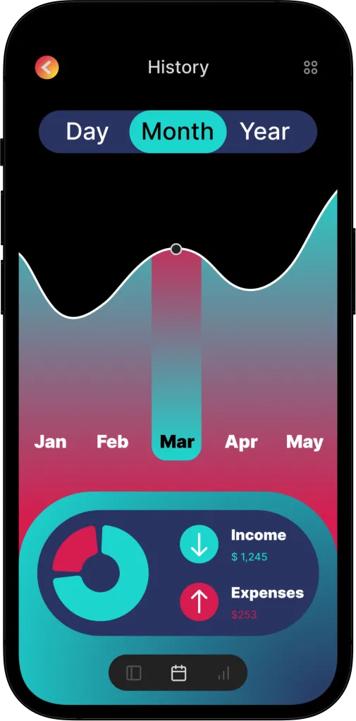
The content of the platform is based on helping the user to organize their finances in the simplest and most customizable way. It shows both the history of your bank account with your income and withdrawals, as well as the distribution of your total money in the different sections important to the user; savings, rent, leisure....
It also incorporates the expected monthly expenses and, in terms of investments, both the money saved for investment and the total value of your investment portfolio.
Within each section it is possible to create different folders. A clear example of this is the fact that within the investment section the user can organize his or her folders into stocks, ETFs, cryptocurrencies, etc.
The money allocated to each section is completely customizable, that is why it is possible to allocate X% per month to savings for example.
The app shows in a clear and very visual way the total percentage that occupies each section and it is possible to activate the option to keep those percentages constant automatically so that, even if there are income/withdrawals of money, the sections are adjusted to what the user wants.

I think it is important to emphasize that one of the major lessons I learned during the process of interviews and tests with the users was the fact that they did not really know how to manage their finances, that is, they were not sure in which percentages to distribute their money in the different sections. This is why I set out to design a solution to this problem:
One of the main features of the final version is the fact that users can access a page that shows the most famous investment and savings rules with an explanation of them and offers the option to implement them automatically to their bank account, distributing their savings in the most optimal way.
These are the most famous savings and investment rules, designed by expert economists, such as the 50/30/20 savings rule which divides the monthly income in such a way that: 50% goes to cover basic needs, 30% is for whims and 20% is saved for the future. These rules are applied as templates that the user can choose from along with the option to customize them to perfectly fit their own situation and needs.